


This is a complete rebranding for the theater company NTGENT.
Consisting of a logo, posters for performances, program booklet, flyers, tickets, instagram posts/stories, tickets, website and an entire campaign.
The concept is built around:
“WHAT WAS, CHANGES"
A variable font was chosen, allowing for gradual pixelation levels throughout the text. This represents change: the serif style symbolizes the old, while the pixelated variation reflects the new.
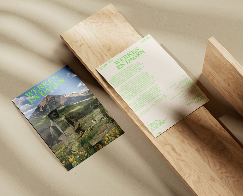
The photography is based on the double exposure effect, a technique in analog photography. Each image consists of two layers: a newly colored image overlaid with an older black-and-white image. These blend together into a single composition.


This is a complete rebranding for the theater company NTGENT.
Consisting of a logo, posters for performances, program booklet, flyers, tickets, instagram posts/stories, tickets, website and an entire campaign.
The concept is built around:
“WHAT WAS, CHANGES"
A variable font was chosen, allowing for gradual pixelation levels throughout the text. This represents change: the serif style symbolizes the old, while the pixelated variation reflects the new.
The photography is based on the double exposure effect, a technique in analog photography. Each image consists of two layers: a newly colored image overlaid with an older black-and-white image. These blend together into a single composition.